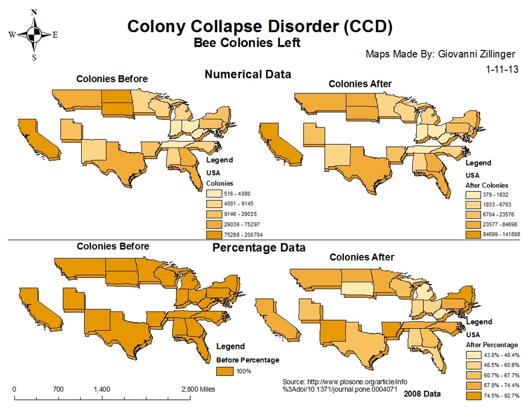
This map, created through GIS technology, represents the decline in bees from 2007-2008. Though outdated, the decline is at a constant rate of about 35 percent annually. The numerical data, the first map, includes how many colonies were lost between the years 2007 and 2008. With this data we were able to estimate a rate of change throughout the United States during the years we observed. Due to the fact that some states originally had larger amounts of western honey bee colonies than others, the comparative loss of colonies across the United States appears to less dramatic than it actually is. In reality it has been proposed by scientists that the western honey bee as a species has lost an average of 50-70 percent of it's population annually since 1970. Unfortunately for us this data was not publicly available in a raw format; ergo, we were unable to utilize the advantages of having the freshest data. Concordantly, while the years 2007 and 2008 are not as updated as we had hoped, we believe that this data illustrates the changes in the bee colonies accurately enough to serve as a data point.
The second map accounts for the varying number of colonies per state by presenting the data according to percentage instead of raw numerical data. This gives us a unique perspective of how the colonies are behaving with the environment that the numerical data could not illustrate. We can see that even between the years 2007 and 2008 many states observed that the bee population dropped from 100 percent to 44 or 48 percent, effectively a 36-32 percent decrease.
These maps have more of an accurate perspective on the amounts of WHB colonies lost. With all of the states originally starting off with 100% and brought down to how many colonies, percentage wise, are left, the states have a better side-by-side comparison in terms of loss.
